This is the harbor in the lovely village of Vernazza Italy in the Cinque Terre region.
The sky in this pic has dust and scratches so I really want to use this photo with a new technique I haven't tried yet.... and that's using textures over the image... thus masking the fact that the sky has blotches. When you do grungy, the most dust the better
1. Manipulated with saturation, contrast and drybrush
Manipulated with saturation, contrast and watercolor
Summer Gypsy 365
Tuesday, September 25, 2012
Facade
This photo was enhanced with increased saturation and a drybrush filter. Too bad there isn't a cat. LOL
5 Boats in Vernazza, Cinque Terre, Italy
Boats in Vernazza Italy in the Cinque Terre with various photoshop filters
1.Saturated and filmgrain added
2. Poster Edges
3. Ripple
1.Saturated and filmgrain added
2. Poster Edges
3. Ripple
Standing Guard
A kitty in the charming town of St. Paul de Vence, Provence, France
1. Basic Photo (saturated a bit)
2. Drybrush Filter added
3. Film Grain Filter Added
Friday, September 21, 2012
IC: mat and frame
Experimenting with adding a frame....
1. Narrow black frame
2. Wider Black frame... this photo was manipulated with a photoshop filter
Day1B: First scan from a negative
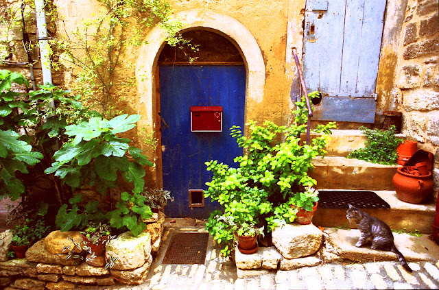
Long ago I bought a Canon scanner with the ability to scan negatives and slides. Yet, I'd never tried out that feature. Until now. I just now have tested it. The photo below, "Blue Shutters" is from a trip to France.
1. This first image captures it exactly as scanned. It appears that the max resolution I can get with this scanner (unless there's an option I'm missing) is 300dpi at a 4x6 inch size. Too bad it's so small. If I were to send the 35mm negative to a photo print shop, it could be enlarged to poster size, since it was shot with an excellent camera and lens.
2. This one I saturated to level 50. I like how it intensifies the blue of the shutters and the richness of the stonework. Saturation of this much starts to make the greenery a bit goofy... so I may limit it with images that include greenery, but for stone and wood, it's good.
3. Then to the saturated image, added film grain
4. And again to the saturated image, added another filter, called simply "grain". I need to pour over the difference between these two to see what's different.
5. Saturated, fresco
6. Saturdated, ink outlines... too wierd.
7. saturated plus drybrush
8. saturated plus poster edges...too hokey for the greenery. Again, it's ok for the stone and wood, but nix for greens.
9. saturated plus texturize...looks like it's printed on textured paper
Keep in mind the limitations to what you can see in all the above "simplified" filters:
1. They were all applied at "factory settings". Many are set too high, and I can experiment with lowering/adjusting.
2. A combination of filters offers a different look.
3. If you apply the filter to the original sized image, and THEN reduce the size, that has a different result.
4. Keep in mind that printing any of these (even the original untouched up version) on watercolor paper or textured paper will add that paper's interesting texture.
5. If the image is TRANSFERED with inkjet transfer or citric acid or white glue or gel medium, the transfer process itself will add lots of interest and texture.
6. Simply adding an interesting border: either wavy or grunge or faux polaroid transfer adds interest too.
7. The next step: painting OVER the printed out photo will add the next level of interest and texture.
Next steps, I want to experiment with how PALE I might print these in order to have a nearly transparent base on which to apply paints and palette knife and other globby things to achieve a gobby gooey bumpy painterly textured result.
1. This first image captures it exactly as scanned. It appears that the max resolution I can get with this scanner (unless there's an option I'm missing) is 300dpi at a 4x6 inch size. Too bad it's so small. If I were to send the 35mm negative to a photo print shop, it could be enlarged to poster size, since it was shot with an excellent camera and lens.
 |
3. Then to the saturated image, added film grain
4. And again to the saturated image, added another filter, called simply "grain". I need to pour over the difference between these two to see what's different.
5. Saturated, fresco
6. Saturdated, ink outlines... too wierd.
7. saturated plus drybrush
8. saturated plus poster edges...too hokey for the greenery. Again, it's ok for the stone and wood, but nix for greens.
9. saturated plus texturize...looks like it's printed on textured paper
Keep in mind the limitations to what you can see in all the above "simplified" filters:
1. They were all applied at "factory settings". Many are set too high, and I can experiment with lowering/adjusting.
2. A combination of filters offers a different look.
3. If you apply the filter to the original sized image, and THEN reduce the size, that has a different result.
4. Keep in mind that printing any of these (even the original untouched up version) on watercolor paper or textured paper will add that paper's interesting texture.
5. If the image is TRANSFERED with inkjet transfer or citric acid or white glue or gel medium, the transfer process itself will add lots of interest and texture.
6. Simply adding an interesting border: either wavy or grunge or faux polaroid transfer adds interest too.
7. The next step: painting OVER the printed out photo will add the next level of interest and texture.
Next steps, I want to experiment with how PALE I might print these in order to have a nearly transparent base on which to apply paints and palette knife and other globby things to achieve a gobby gooey bumpy painterly textured result.
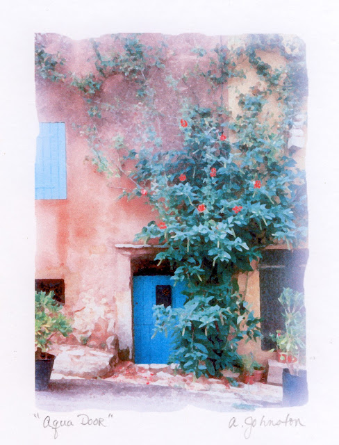
Day 1: Beginnings and "Aqua Door" print
This is Day 1 of my plan to post one photo every day for a year. This doesn't mean that I'll actually "take" a photo every day, for that isn't my goal. The goal is just to post one, for what I'm really trying to encourage myself to do with this project is to dig back into my collection of old photos and take some time to revisit them, first just to "air them out" and eventually to begin expermenting with some painterly approaches to them ...
For today, I've uploaded a photo from a long ago European trip. I think this is from France, but I'm not sure. I need to unearth my little logbook that keeps track of what was taken where. This photo, I'd already done some manipulation with photoshop. It's been so long ago, I don't recall exactly what I'd done, and then I'd printed it onto white cardstock. This is a scan of that piece.
For today, I've uploaded a photo from a long ago European trip. I think this is from France, but I'm not sure. I need to unearth my little logbook that keeps track of what was taken where. This photo, I'd already done some manipulation with photoshop. It's been so long ago, I don't recall exactly what I'd done, and then I'd printed it onto white cardstock. This is a scan of that piece.
Part of the goal of this project is that I plan to return to Europe in April. And to revisit the idea of photographing windows and walls, gates and gardens. And this time, I'd like to go beyond simply capturing the scene with naked photography. This time, I want to take the raw images and manipulate them with painterly approaches. Meaning paint and other media. And photo transfer techniques, including those that simulate polaroid transfers. I'd like to test out transfers using citric acids, Elmers Glue, and iron on transfers to transfer the photos to canvas, then to be painted over with brush or palette knife for globby gobby affects.
So there's day 1. Simply a photo.
Subscribe to:
Comments (Atom)


